hawk
January 5, 2015, 9:47pm
1
Hi All,
Just a quick note on this new look feel layout:
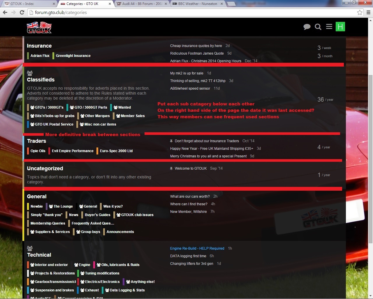
After selecting a category the sub sections look crammed up and the colour bars and text blend in for my poor old eyes
White on black / dark background is not good for old eyes
Previously I could spend hours on here but not now
spiros
January 5, 2015, 10:01pm
2
You’ll get used to it in not time, if not put Your
Hi @hawk ,
Thanks for your feedback.
I do understand and there are tweaks made all the time to improve visibility in different areas.
If you really want it to be clear plan colours currently our mobile theme is very basic.mobile theme by clicking here or go back to normal by clicking here .
I don’t think the snow helps currently
Feel free to share more thoughts on this.
Cheers,
hawk
January 5, 2015, 10:07pm
4
PMSL put the shades away till the SUN comes out
1 Like
I’ve just put the brightness up on the normal text slightly - hopefully that helps a bit.
hawk
January 5, 2015, 10:13pm
6
Hi Dean,
The mobile theme appears a little dull (In comparison), I do like the GTO in the back ground!!
I do notice the blue on the black / dark background is better for my eyes
You may be right about the snow
Yes the brightness does help
Thanks Hawk
@hawk - if you could change anything - what would it be?
(I’m not saying I’ll do it - but I’m open to suggestions from anyone)
The snow has been cleaned away too.
hawk
January 5, 2015, 10:32pm
9
Thats loads clearer,
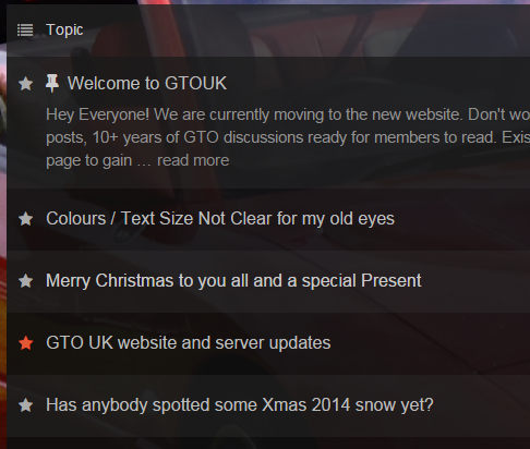
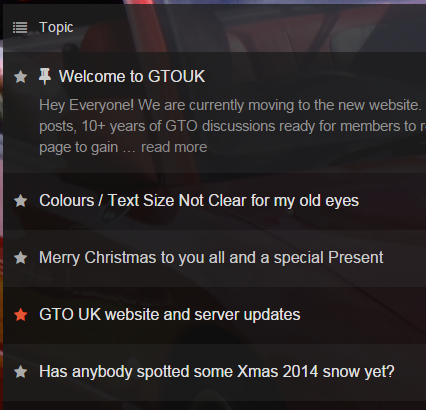
just doing you an image of a suggestion
I like easier picture upload, nice one
1 Like
hawk
January 5, 2015, 10:33pm
10
I hope you can see the suggestions ? (I just read this, sorry Dean its not supposed to be sarcasm or anything I was just asking)
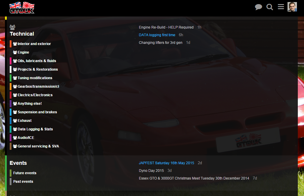
We have tried the sub-categories line by line - but you end up with a very long page because of just how many categories we have here.
Here is a quick screenshot of how that looks for just one section:
We don’t want to over-load users with too many numbers so it’s best we don’t include the last access date.
Our experience is that users tend to use the Latest New Unread
Categories
NAS
January 5, 2015, 11:02pm
12
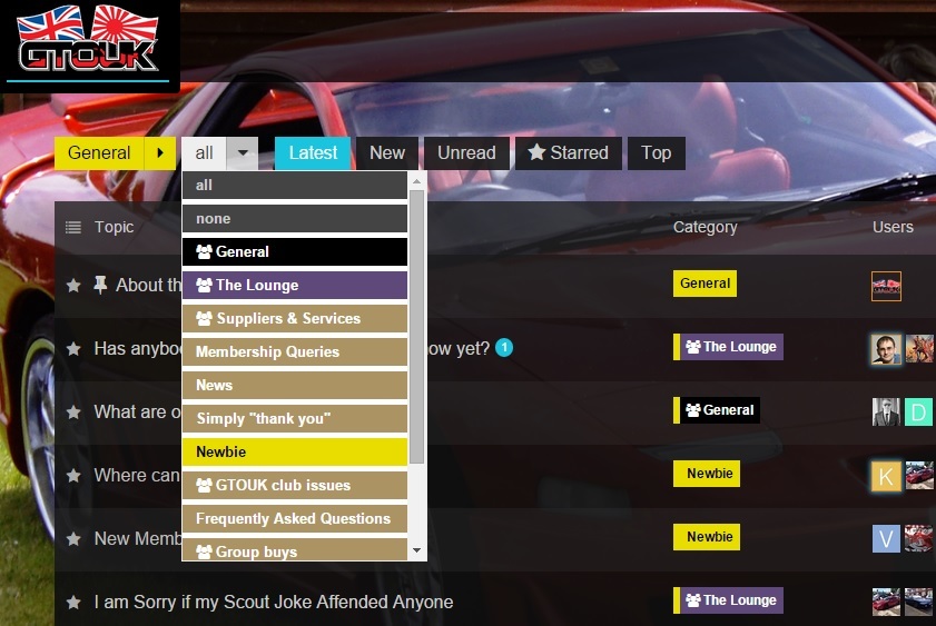
Use the menu system and sub menu at the top. Its much easier, I have never looked at that menu ever
1 Like
NAS
January 5, 2015, 11:06pm
13
@DeanMarkTaylor can we have that as an option on the site somewhere, for anyone who rather have that clean option?
Neil.
@NAS don’t make things complicated dude … we need to find what is best for the majority and go with it.
EDIT: As it is works really well with less categories - that should be our first port of call.
1 Like
I’ve just pumped the white in the latest list too…
Before:
After
2 Likes
hawk
January 5, 2015, 11:12pm
16
Hi Dean,
Thanks for the explanation / example I understand it now
Defo better with no snow and the brightness changed
I will preserver with the new look site
Thanks for your time and considerations
1 Like
Feedback is always welcome @hawk .
Just open a topic to discuss anything club or website related.
1 Like
Butler
January 5, 2015, 11:16pm
18
I think from talking to Neil at dean at the Christmas do a lot of the sub categories are going to be simplified in the future anyway due to the overly complex nature of the old site, although this requires manual moving of all of the old posts to new categories so will take time, and will definately clear things up.
2 Likes
Also I find cleaning my glasses helps loads when feeling blurry eyed
hawk
January 5, 2015, 11:54pm
20
I have just ordered a year’s supply of:
http://www.boots.com/en/Boots-Pharmaceuticals-Spectacle-Lens-Cleaner-120ml-_1132029/
LOL
Last suggestion for tonight, is it possible to open links in a new tab? (This would save using the back arrow, and would allow reading of both sites at the same time, this is useful when following members advise)
Thanks All


 on
on